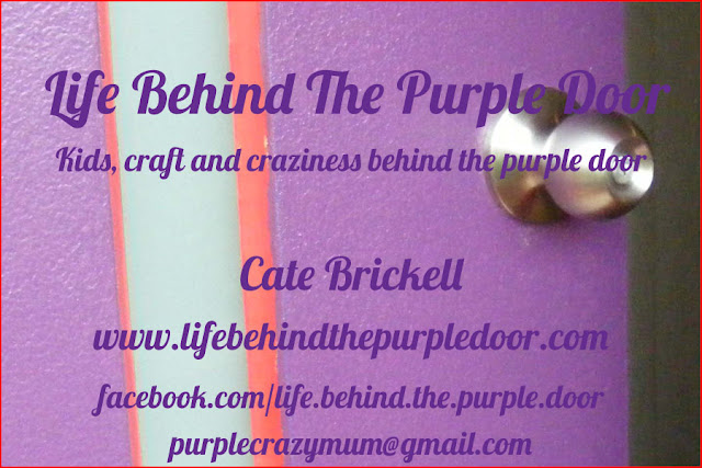
I'm heading off to a blogger's meet and greet on Sunday. I'm not really interested in building my blog from a PR/making money angle, but I do want to meet some of the other bloggers that I have connected with (mostly through facebook and reading their blogs). So I decided last week that I really need a contact card (which I think sounds a lot less formal than "business card"), and because my front door is my logo (and most businesses use cartoon logos, rather than photos), I decided to make my own.
That's where your help comes in. I've printed two different options, and now I see them in my hands, I'm not sure which one I like best.
Option one has all the information in one place, on the front, and will be backed on red cardstock (to create a red border around the photo) that will be left blank.
Option two has just the name of the blog on the front, with the details below printed on red cardstock attached to the back.
What do you think?


Option 2 seems easier to read - i like clean and clear - and I look froward to getting one on Sunday!
ReplyDeleteDeb @ home life simplified
I like number 2 as well! I also look forward to meeting you on Sunday!
ReplyDeleteYour newest liker & fellow blogger!
http://sewcooklaughlive.blogspot.com.au/
I like the second option, too. It really makes your blog name & photo the focus, yet all the other information is found easily on the back. Enjoy the meet!
ReplyDeleteI'd opt for the second one too, but try and get a little more contrast going between the background and the text. If you're set on purple text, perhaps desaturate the background image a little and play about with drop shadows or outer glow on the text (a very pale yellow outer glow would define the text well). :)
ReplyDeleteI really like the second options....it reads really well!
ReplyDeleteLike the idea of a "contact card" instead of a business card!!
Have fun on Sunday :)
Cheers
Lisa
I like the second one too. It makes me want to turn it over and see what it says!
ReplyDeleteI'm for #2 as well :)
ReplyDeleteSeems I agree with everyone else. I like the way the logo is less 'cluttered'
ReplyDeletedefinitely #2 and "contact card" sounds great, I hope you have a great time :)
ReplyDeleteNice idea! I hope you have a great time at the meet.
ReplyDeleteI'm with the others - the second option is easier to read. But I do like the idea of including the purple door somehow because it supports your blog title and would help people remember it
#2 for me too Cate..enjoy your meet
ReplyDeleteAlison xx